





Creative Designer
Strategy, identity and creative direction that connect business ambition with clear, distinctive brand experiences.
Strategy, identity and creative direction that connect business ambition with clear, distinctive brand experiences.
I’m a Creative Designer with over 8 years of experience. Proven in transforming businesses, scaling premium global brands, and driving market leadership through strategic branding and marketing. Known for delivering strong products, retail presence, and creative leadership.







Brand strategy &
creative direction
Branding &
packaging systems
Creative leadership
& AI workflows
Web & digital
experiences
while actively exploring and integrating AItools across design, art direction, conceptdevelopment, and creative experimentation.








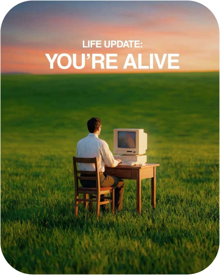





I like the simplicity of letting
a brand’s personality speak.
Distinct by design.Built to be remembered.Let the brand speak.
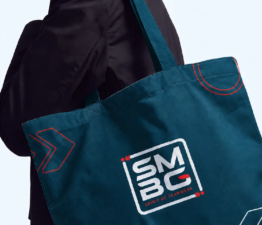
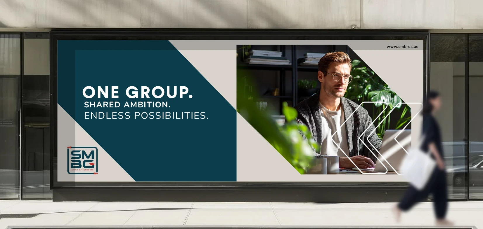
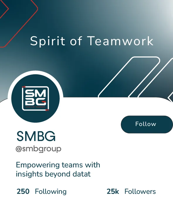
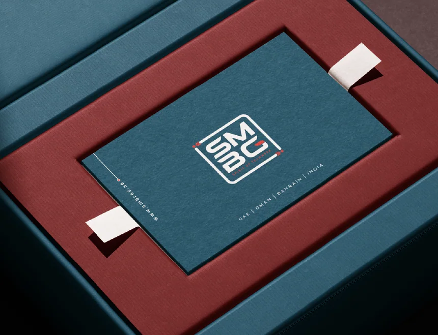
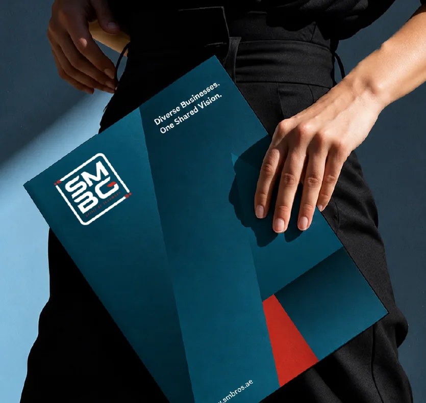
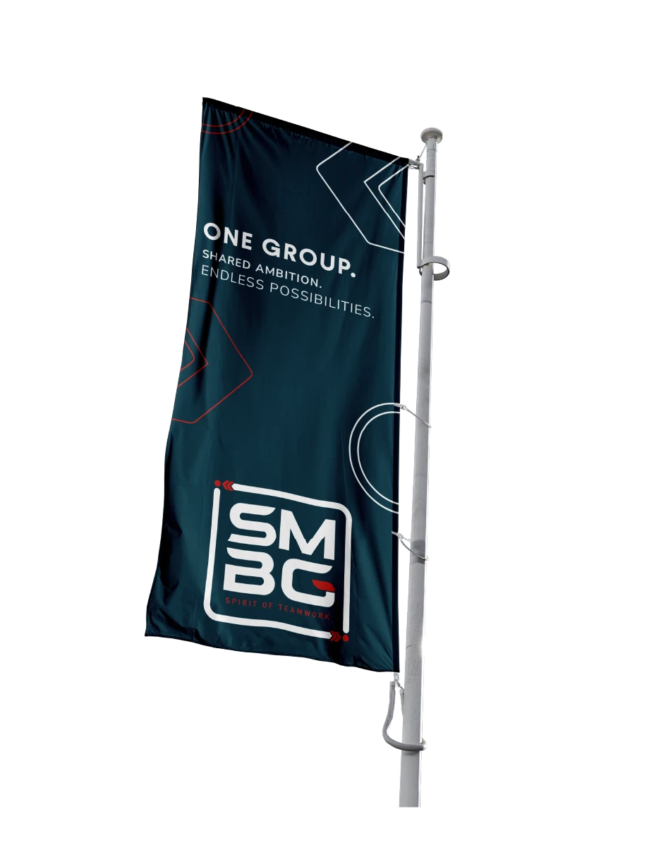
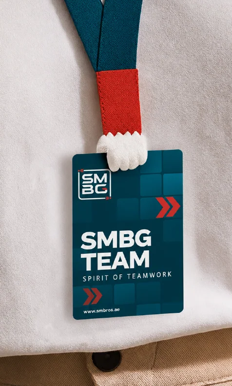
SMBG is a UAE-based group of companies, formerly known as Aquarium Lives Centre. It began with pet and aquatic supplies and grew into consumer goods, office supplies, printing and graphics.The brand’s job: Many businesses had to look like one trusted group, not a small wholesaler. The brand needed to feel strong, structured and united. Its core belief is “Spirit of Teamwork.”What I did: I rebranded Aquarium Lives into SMBG. I created the logo with bold, structured letterforms and a connected frame for unity, in deep teal and red.

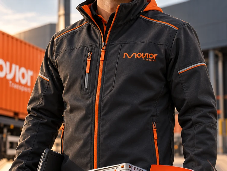
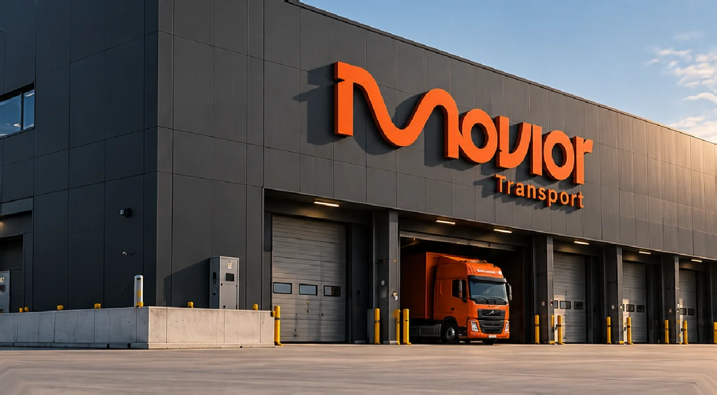
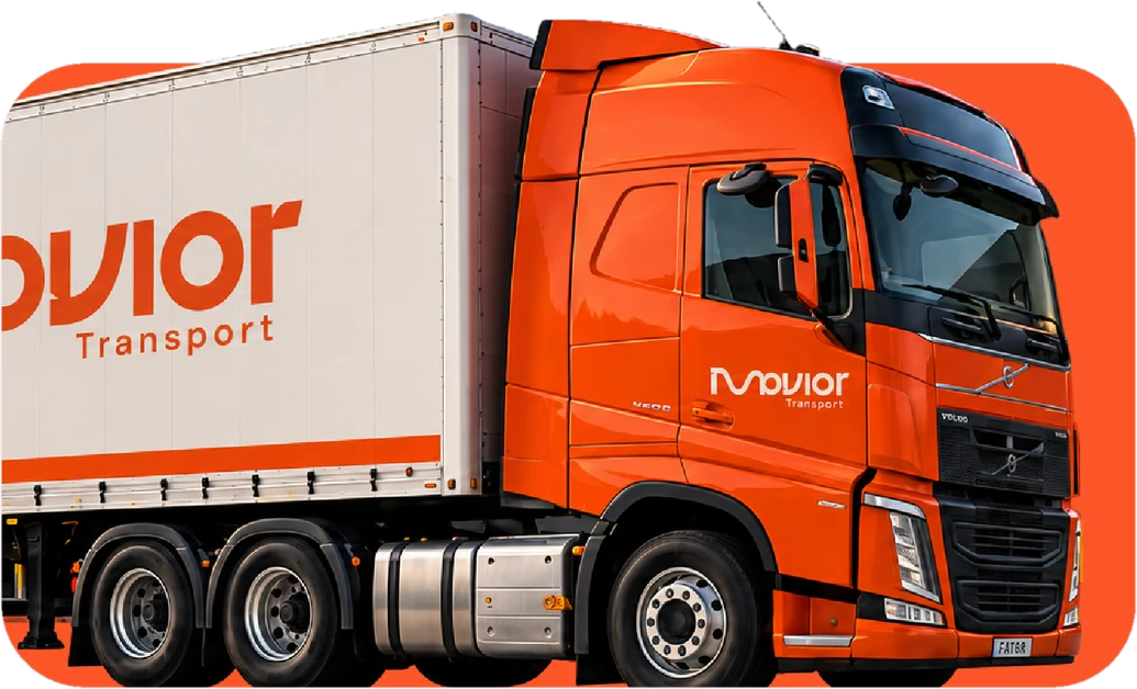
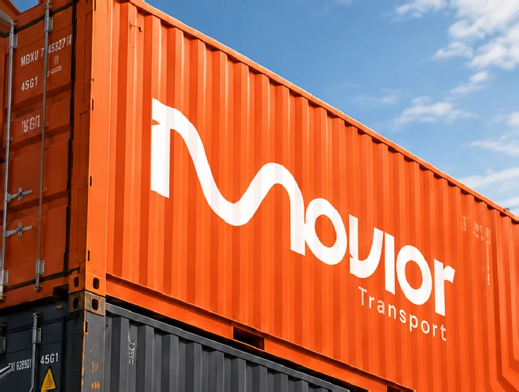
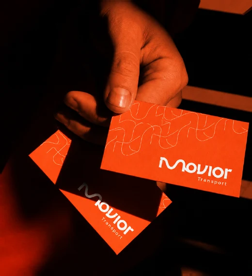
Movior is a transportation company that moves large cargo with strength, precision and care.The brand’s job: In cargo, clients choose the company they trust. The brand needed to look strong and reliable, and to show constant movement and progress. It also needed to work on a truck, a container and a phone screen.What I did: I designed the full identity. The logo is a flowing “M” that suggests an open road, in a vibrant orange that shows energy and confidence.


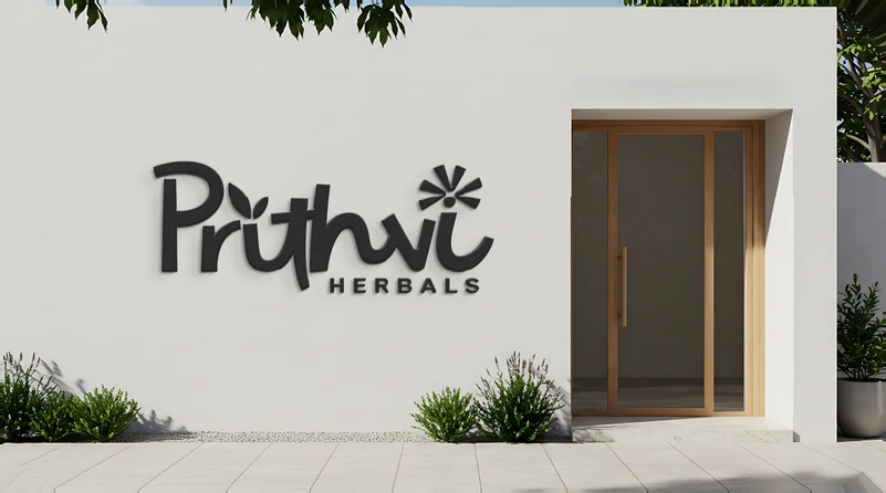
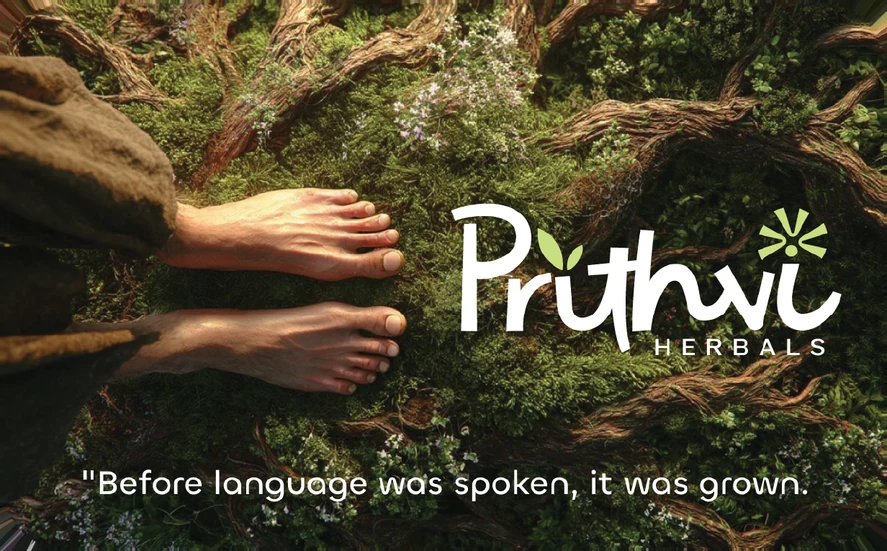
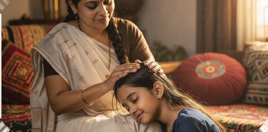
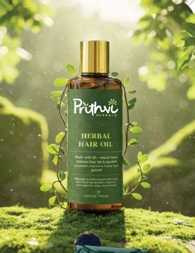
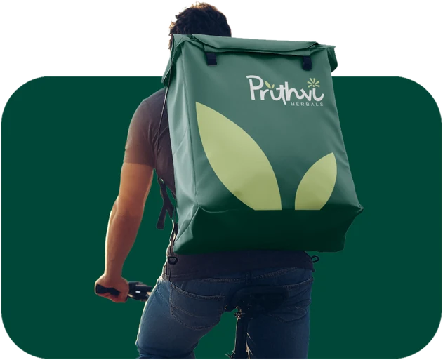
Prithvi is a Kerala-based herbal cosmetics brand. It makes 100% natural, plant-based beauty and wellness products for women, mothers and children. It uses herbal extracts, natural oils and Ayurvedic knowledge, with no harmful chemicals, artificial fragrances or toxins.The brand’s job: The products are used by mothers and children, so the brand has to feel pure, safe and honest. It also has to carry the heritage of Kerala.What I did: I designed the full identity, starting with the logo. I built it on three ideas.Connection: I linked the letters with flowing strokes, like a mycelium network. It shows that all life is connected.Roots: I drew the strokes with changing widths, like Devanagari calligraphy. This grounds the brand in its heritage.Sun: I placed a sunburst over the final “i”. It shows the result of growth, so the logo tells a small story from connection, to roots, to sun.

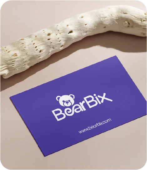

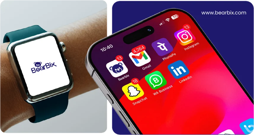


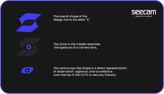


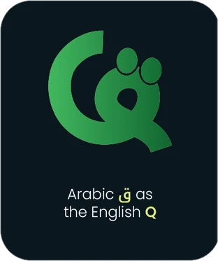
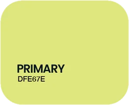
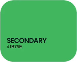
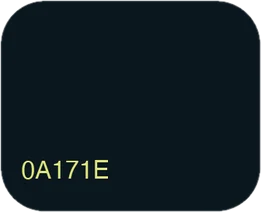





Every brand has a story. My approach to logo design is to give that story a distinctive visual form through thoughtful typography, meaningful symbols, and considered colour choices. This collection spans playful consumer brands and confident corporate identities, each shaped around its own personality and audience. Together, they reflect my focus on creating logos that are clear, memorable, and adaptable across print, packaging, and digital spaces.






Trust without
looking traditional.
Designed to stay
in mind.

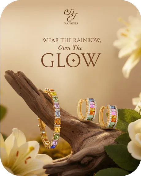
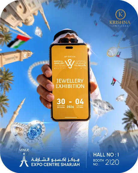
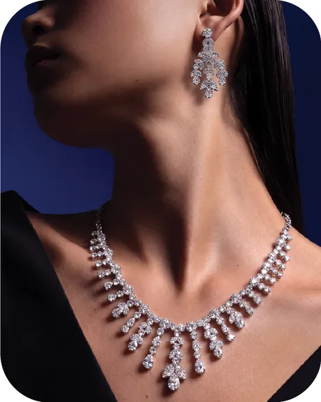
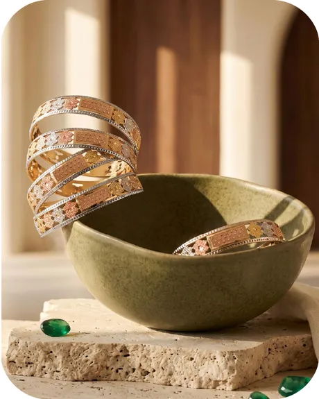
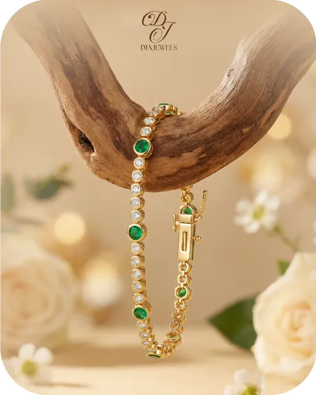

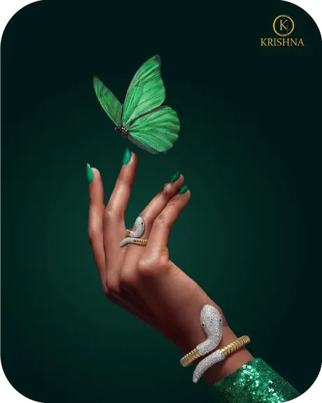
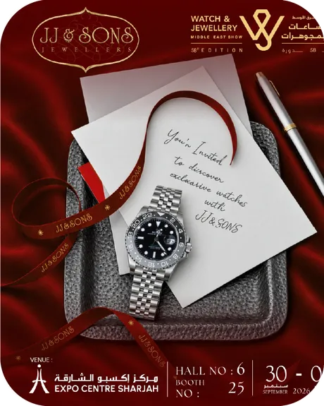


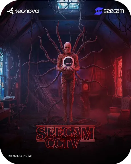
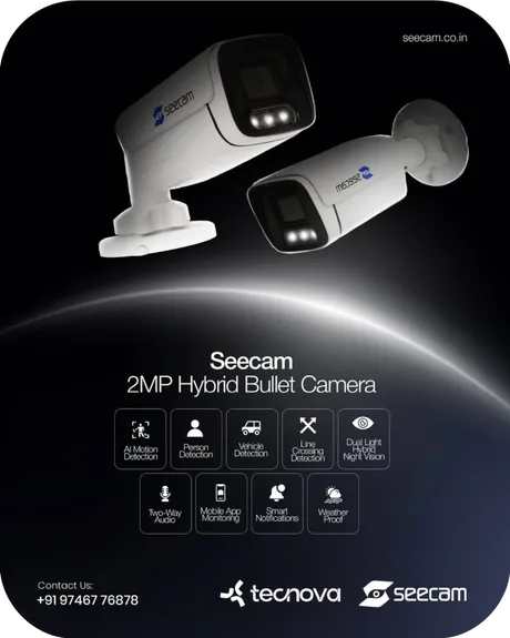
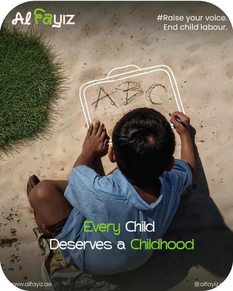

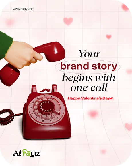
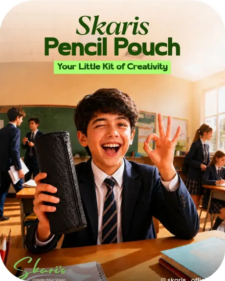
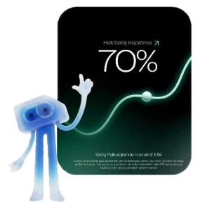
Visuals that
capture attention.
Packaging that feels
warm and personal.
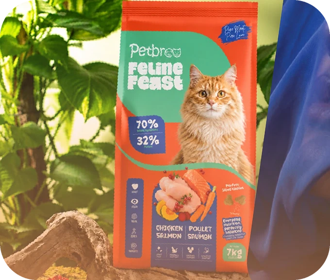
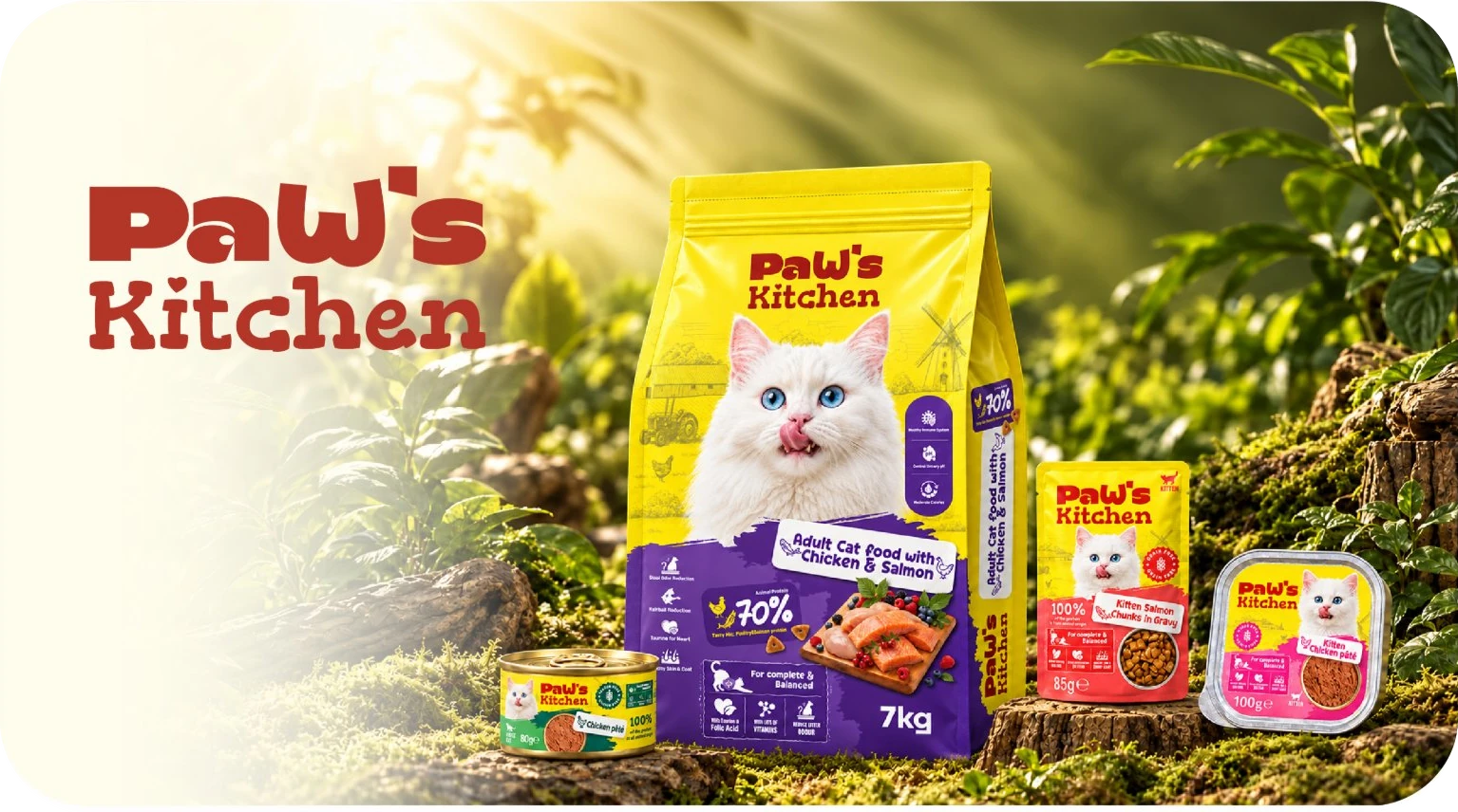
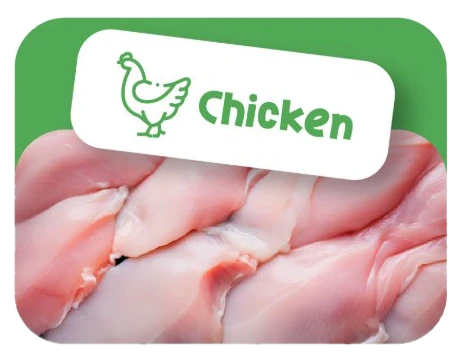
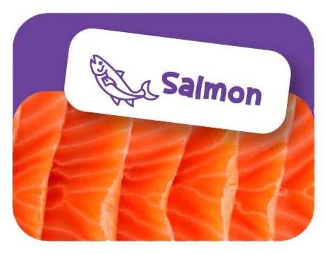
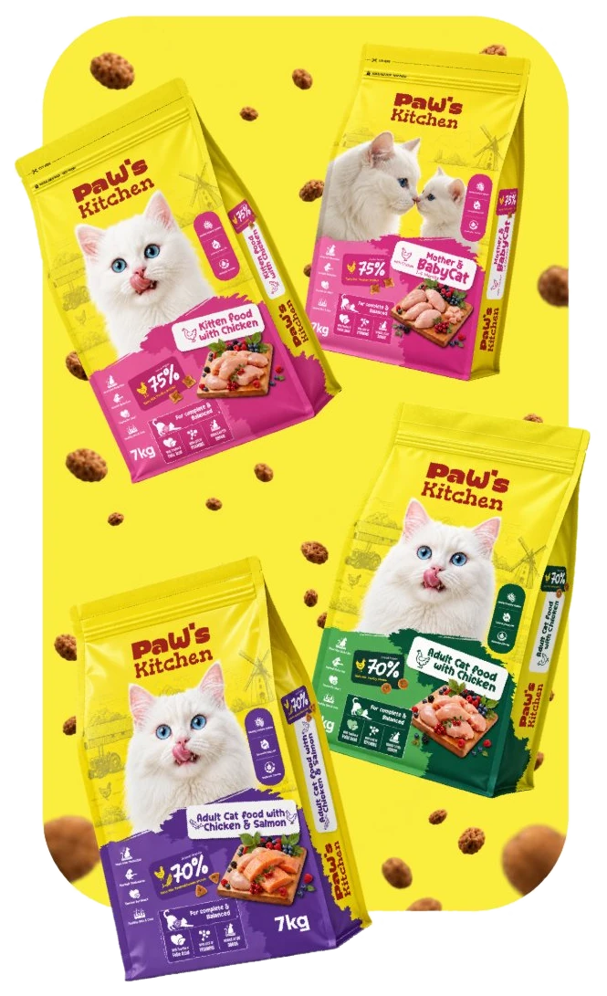
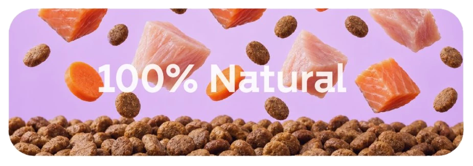
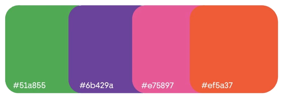
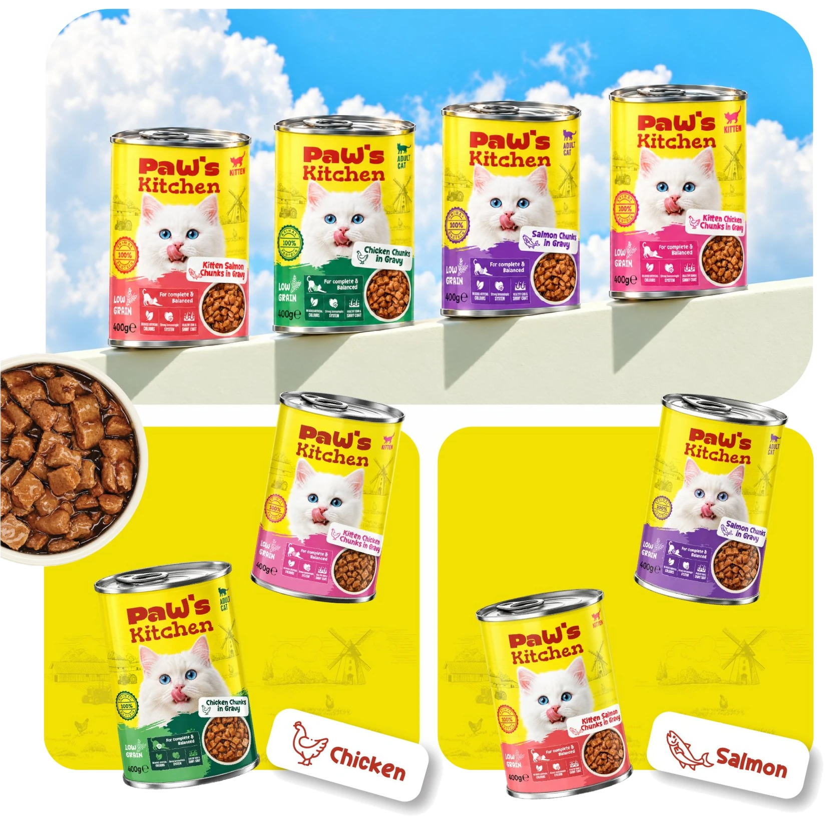
Paw’s Kitchen brings a playful, caring personality to pet food packaging. Bright yellow, expressive typography, and charming cat imagery create a welcoming identity, while distinct colour accents help shoppers recognise each recipe. Across bags, pouches, cans, and trays, the design balances appetising food visuals with clear product information, bringing the range together as one recognisable family.
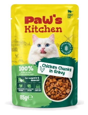
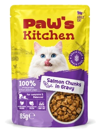
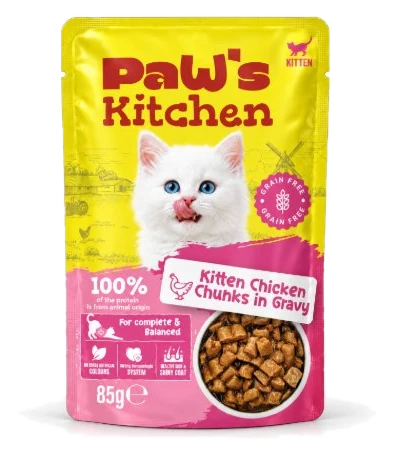
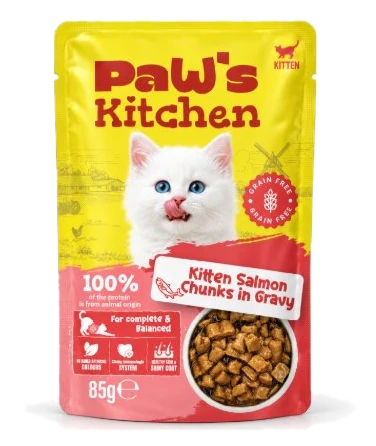
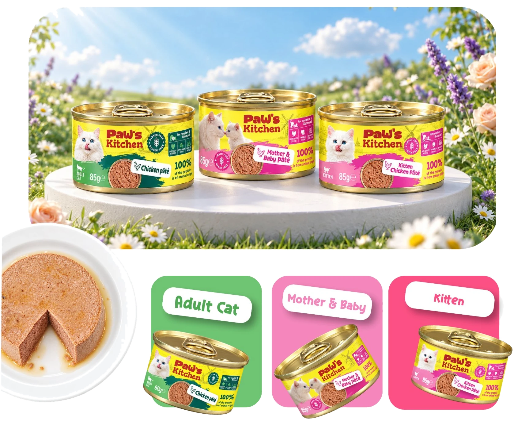
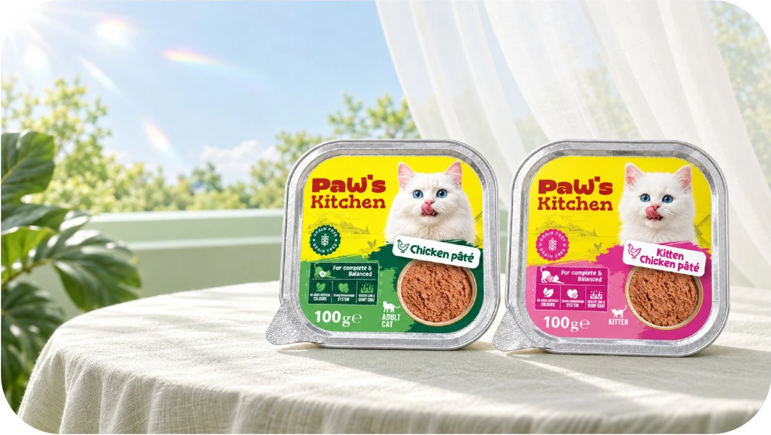
Click for more products
Every frame, a purpose.
Every movement, a story.
Make your brand move.






for scrolling all
the way down here!